When I open the blog "blog guidelines" through the provider, this blog featured mobile device adjust the size that I use with different views when we open it up through the desktop computer. It's just that there are widgets on a blog does not appear when opened using mobile media.
At this time the post I will try to make my experience of wdiget appears when we open in mobile, or often called as responsive.
What is template responsive?
Responsive template is one way that is used to create design templates blog/website to be able to adjust itself on a device used by the visitor, whether orientation or size. When visitors use your desktop computer with the width then the blog/website will perform width anyway, if the blog/website is opened via a smartphone then it looks will automatically adjust the size got smaller smartphone, and usually if the blog is opened using a smartphone then the look of the blog will be different with the look of the desktop.
To know the appearance of responsive on Smartphones we can easily look at it with a smartphone or other mobile device. The easiest way is to shrink the size of the browser used.
Template responsive tend to go in on a mobile device
By default the template actually on blogger had already prepared a mobile version, it's just a mobile version that is available by default on blogger not displaying the widget, it is actually making the blog when accessed via the device of the car became lighter, only widgets that we make in the blog are not shown on the mobile version of the default template blogger.
Well, from the description at length above, let's try making our blog template be responsive and can print widget on your blog.

To make the template blogger be responsive is as follows:
1. Open the bloggers and login with your account
2. Locate the template > Edit html
3. Search and find code
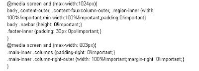
4. Replace with code:
5. Find again the code
6. Add the code above

7. There is still one more, find this code:
8. Replace with code:

9. Save template
Refer all complete code here : goo.gl/hvLuMN
how to display the mobile version of this template?
The mobile version of the template to display/show template edit results that have responsive we're working on are:
-You are still in the position log on blogger
-Select a template
-Once you are on the page of blogger-template, you'll see the look of your template.
-To display the template in blogger responsive edits you, please click on the Rounded serrated Marks under Mobile

-Then the menu appears Choose mobile templates
-Select: Yes. Show template mobile on mobile devices.
-SAVE
See the look of your blog via mobile device, so your blog's template looks responsive customize your device screen sizes.
Pretty in here a discussion of: How to make Responsive Blogger Template. Hopefully it can help, and don't forget to leave a comment

0 Komentar